
Kite Konnect
Kite Konnect, by Kite Pharma (a Gilead company), streamlines CAR T-cell therapy for healthcare providers and patients. It simplifies enrollment, coordinates care, and ensures accessibility with support like financial aid, housing, and transportation.
Disclaimer: The work shown was completed during full-time employment and is shared to highlight my role and contributions. This is not a client of Stone Interface.
Client
Gilead
Role
Product Design (UI)
Tools
Figma, Stark, WCAG
Status
Challenge
Providers lacked a centralized, easy-to-navigate tool to guide patients through CAR T-cell therapy. The client needed a streamlined solution to help treating and preferred providers take quick, informed action without delays or confusion.
Goal
How might we design a user-friendly, action-oriented platform that empowers healthcare providers and patients to navigate the CAR T-cell therapy process with clarity and speed?
Solution
We adopted a clinical minimalist, responsive web design approach to create a clean, efficient interface that supports timely decision-making, reduces friction in care coordination, and meets accessibility standards—aligning with healthcare UX best practices and the priorities of regulated environments.
Worked closely with a UX architect to create a user-focused site map that simplified navigation and supported quick provider action.
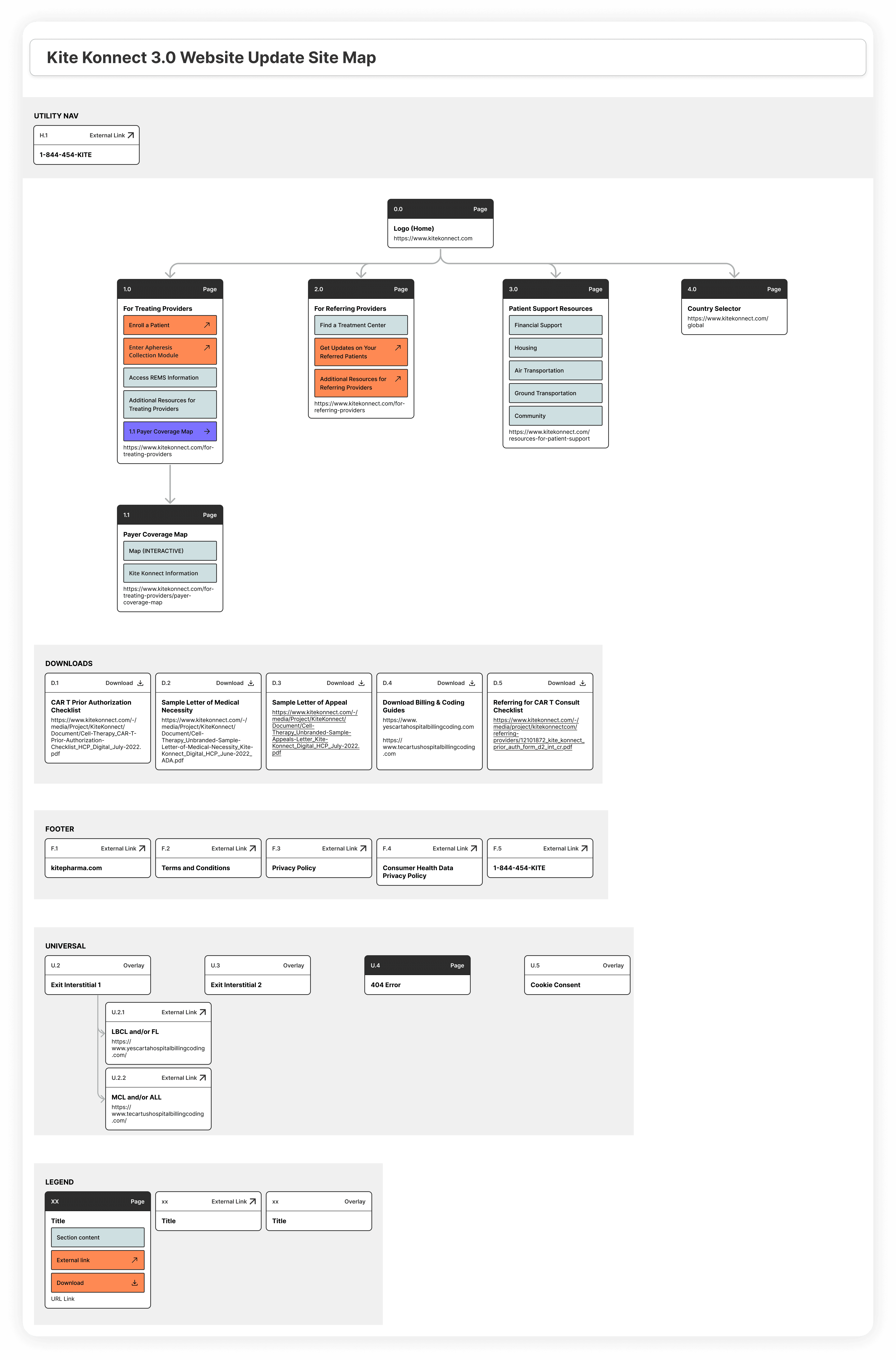
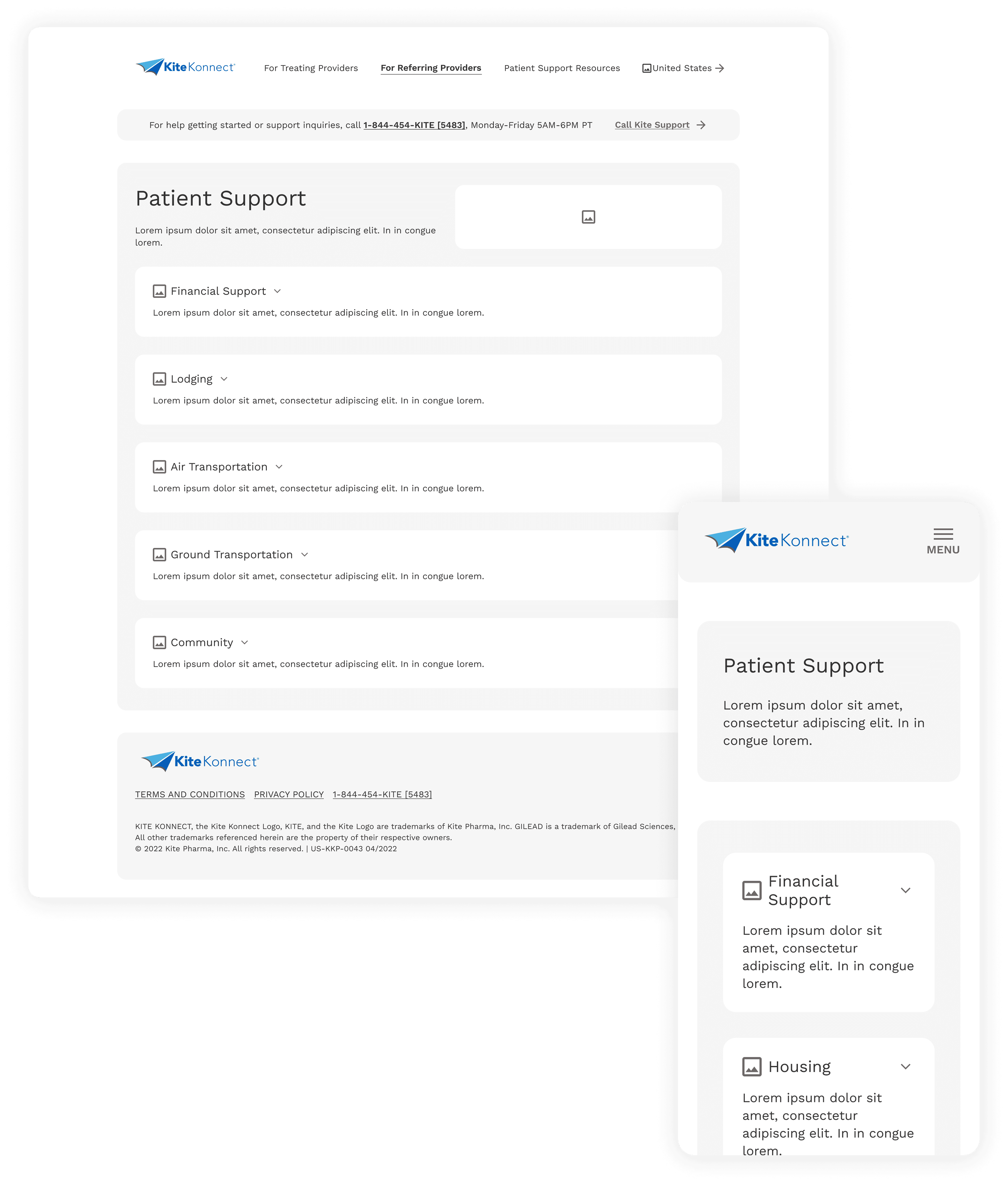
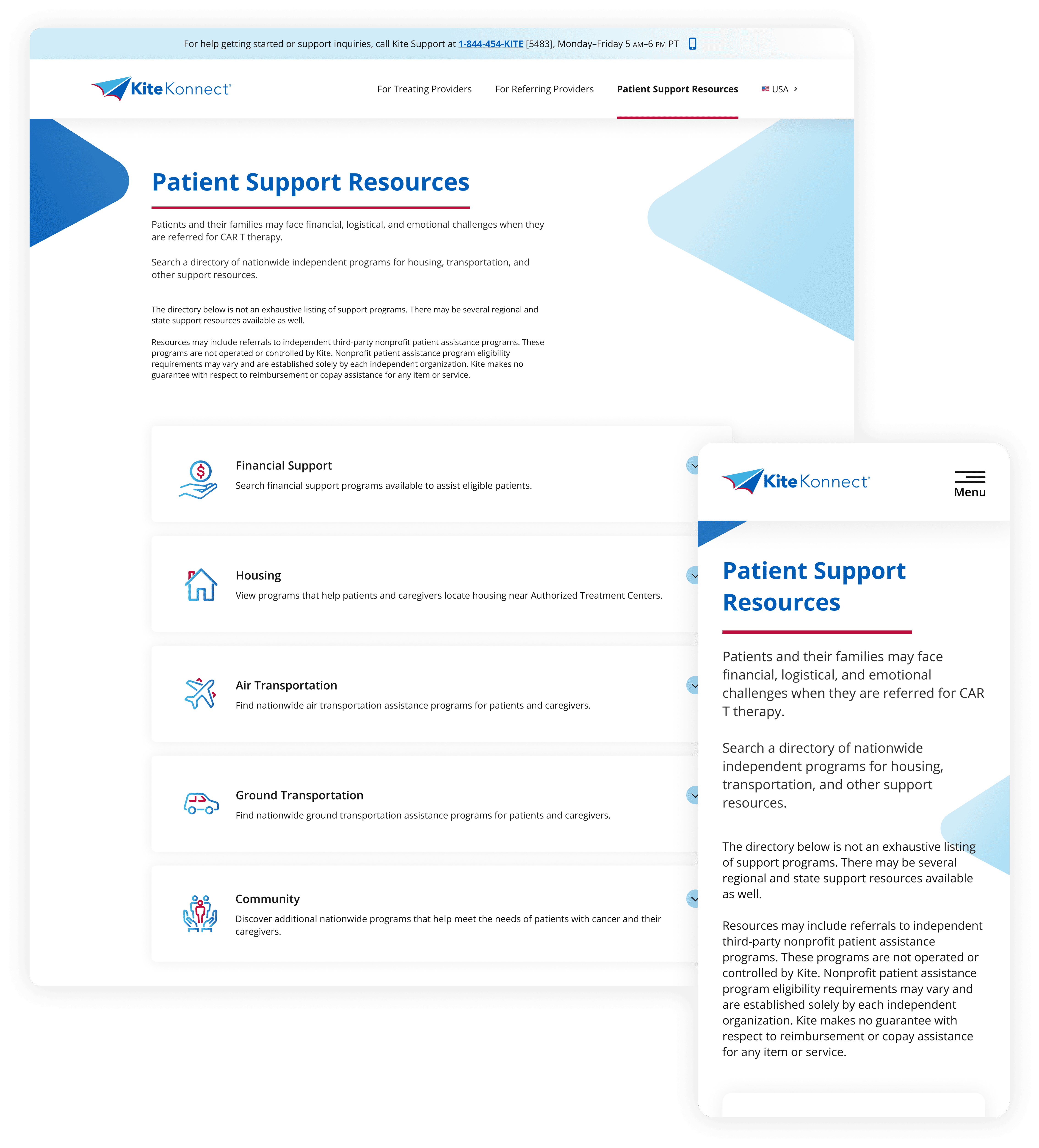
Using Figma, our UX architect and I collaborated on wireframes that reflected a clear, intuitive structure tailored to both treating and preferred providers. Given the content-heavy nature of pharma sites, we incorporated user-friendly features like accordions (see image 3) to streamline information flow and make navigation more efficient.
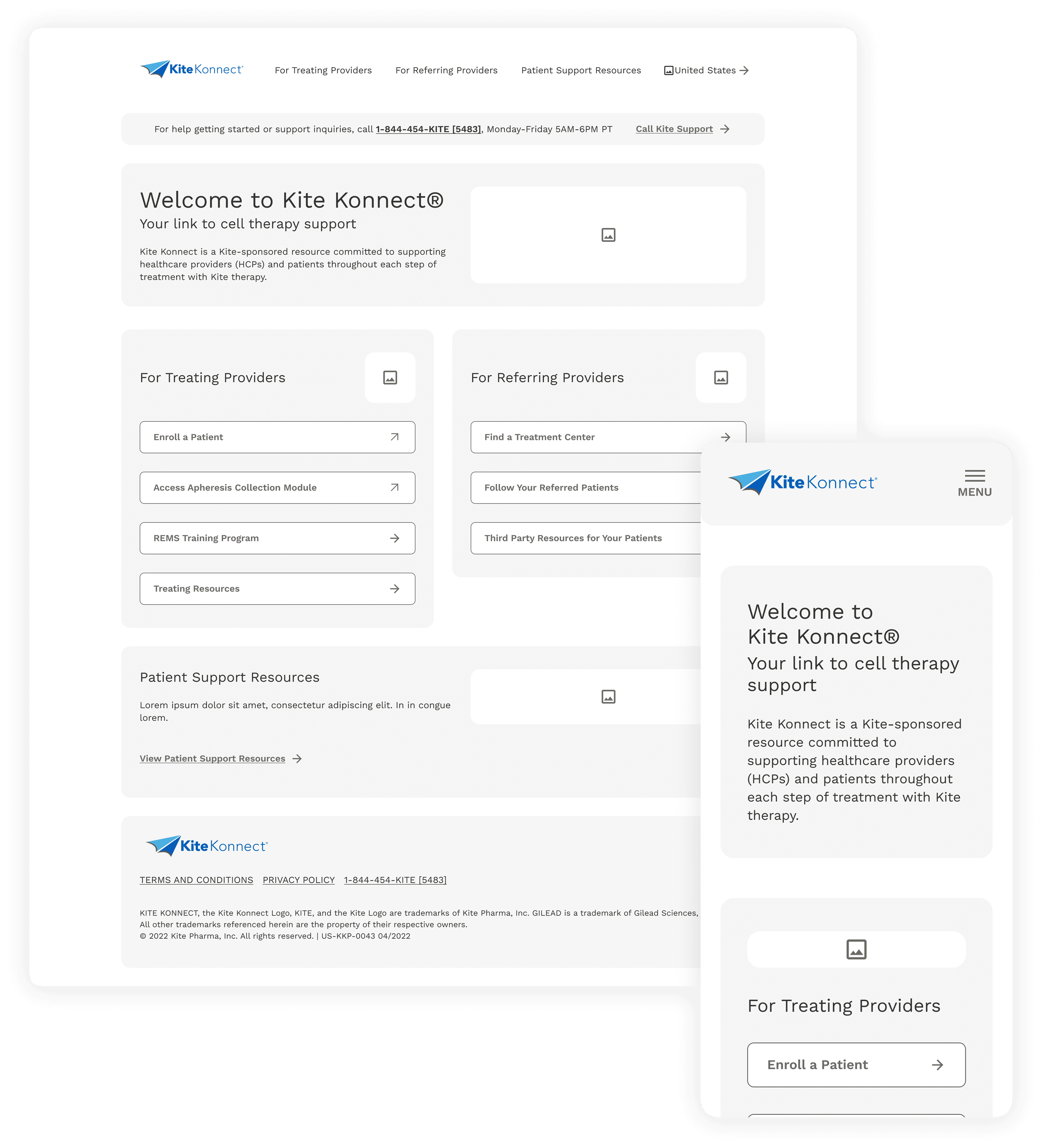
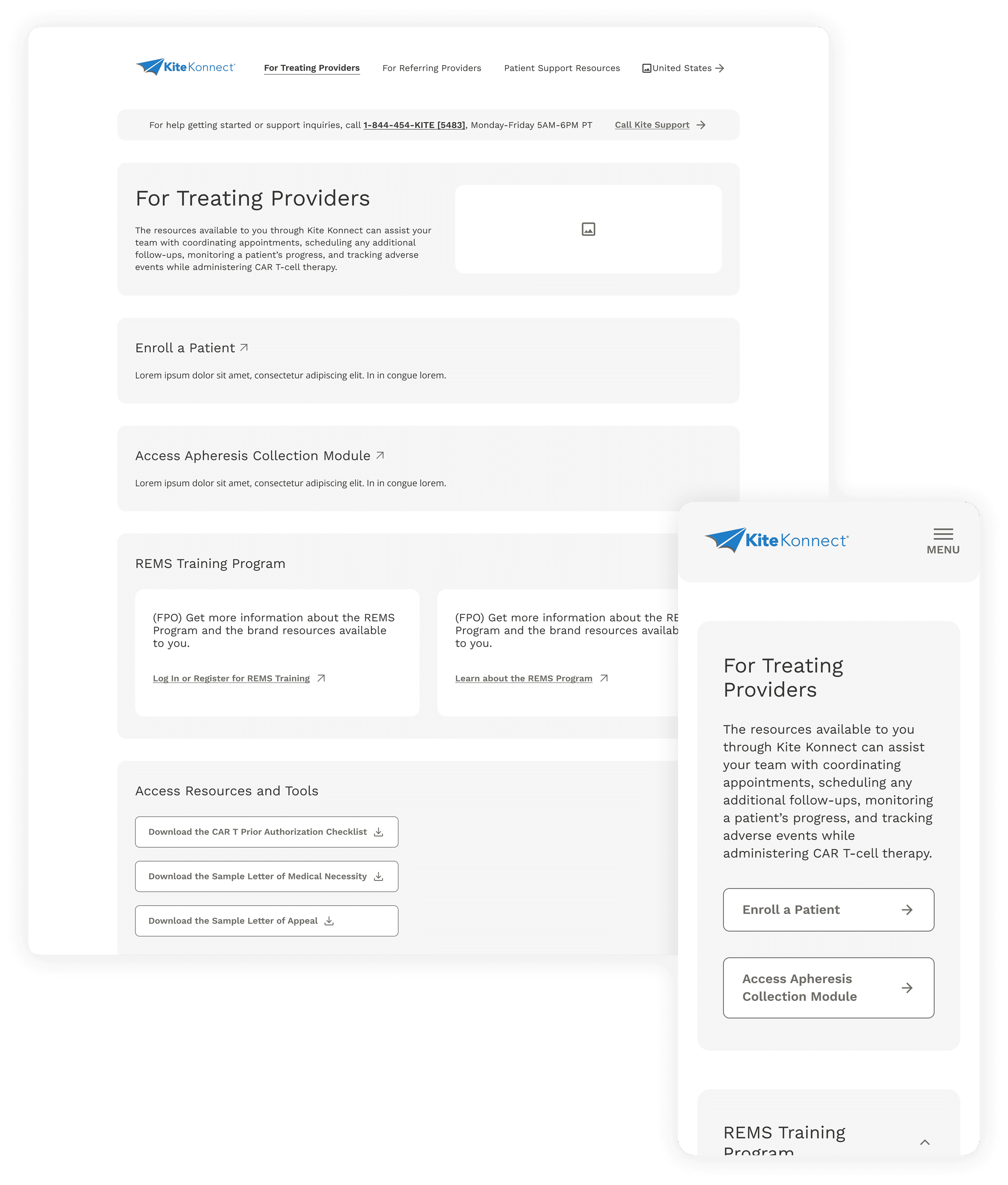
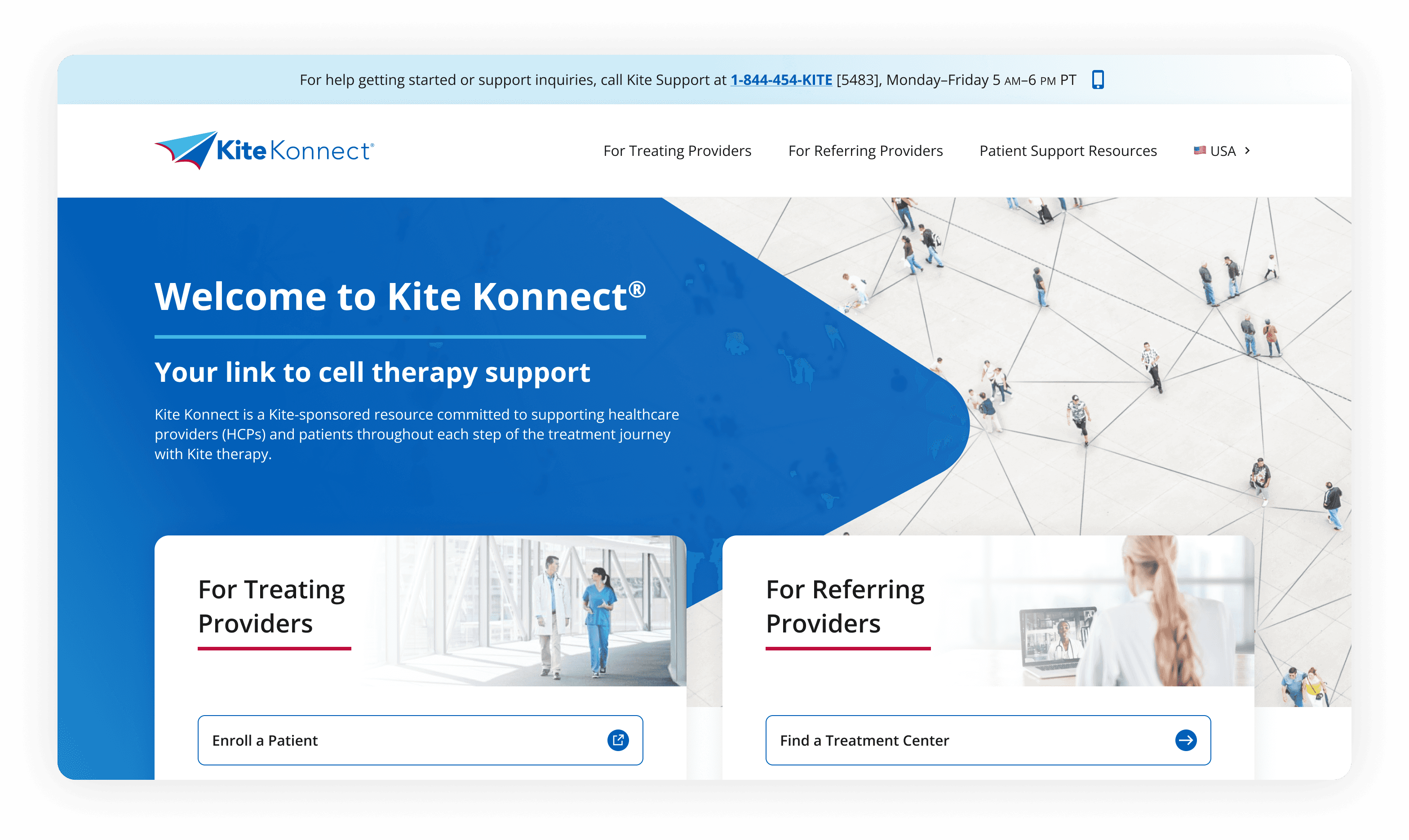
This is where the wireframes came to life. I collaborated with the copywriter to refine messaging, the art director to implement branding, colors, and imagery, and our ADA specialist to ensure accessibility. Using Figma and tools like Stark, we transformed the structure into a visually engaging, ADA-compliant experience that aligned with both user needs and brand standards.
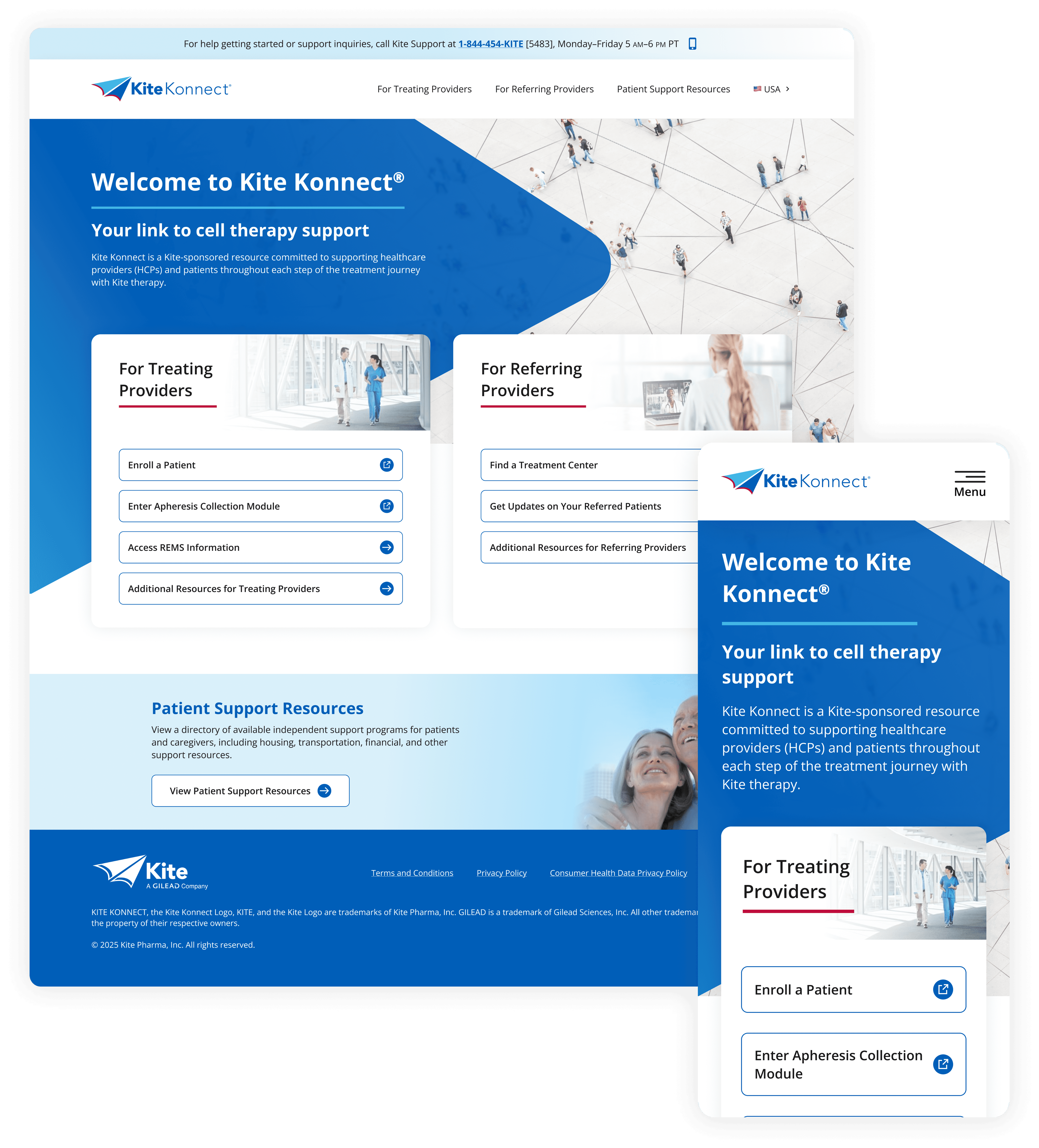
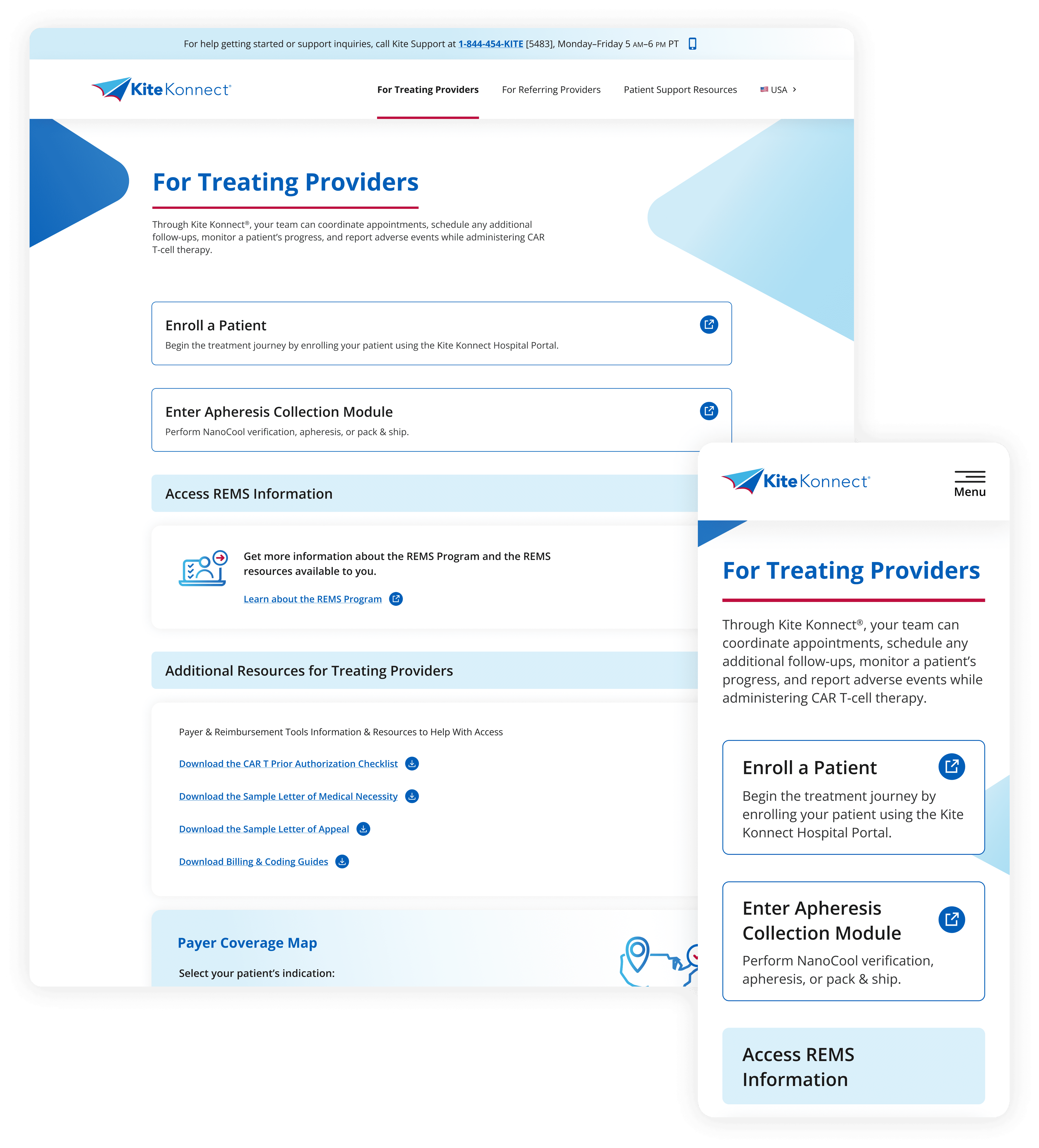
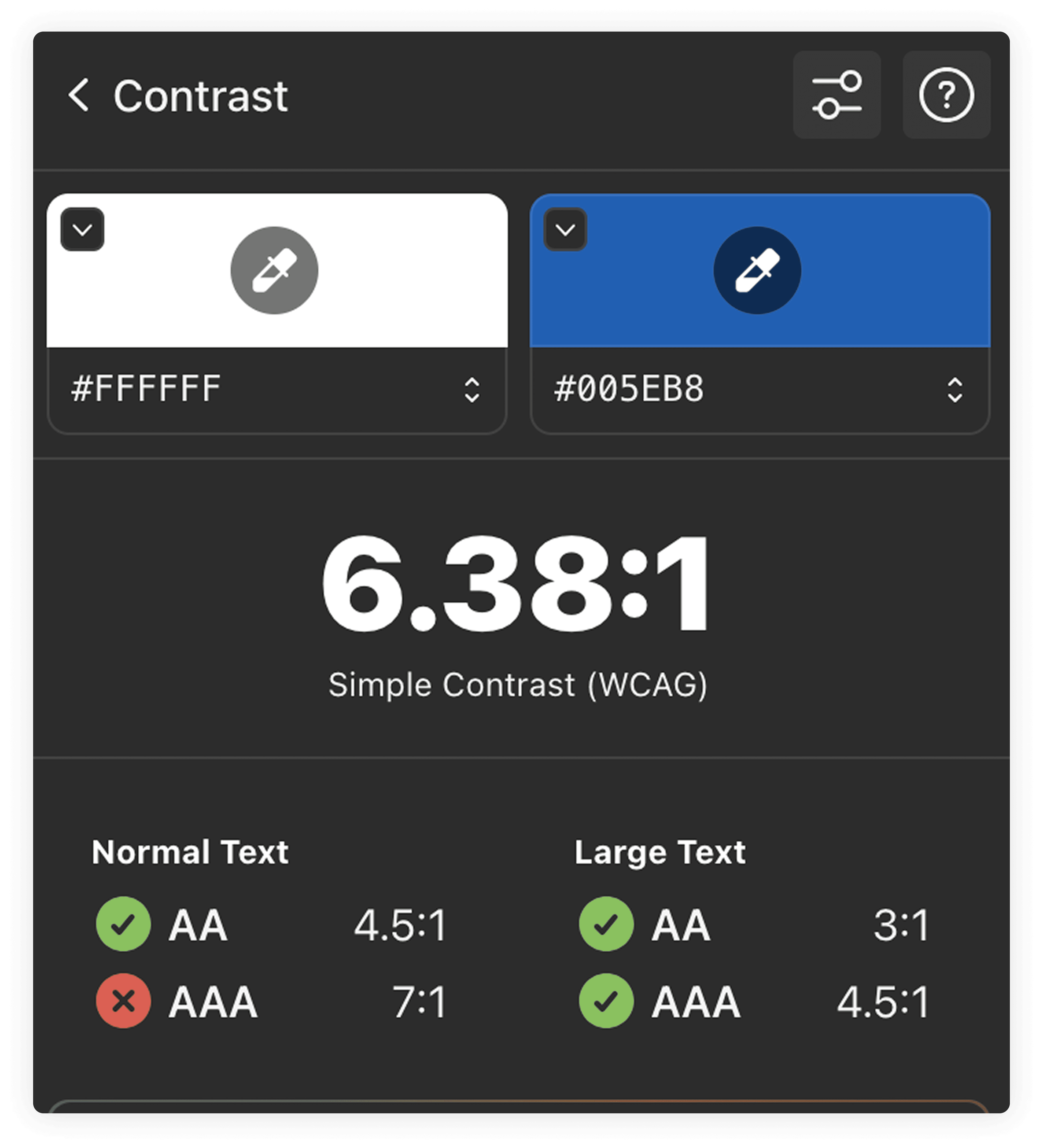
Accessibility was central to our design. We used Stark to meet WCAG 2.1 AA/AAA standards, verified contrast ratios, and ensured font sizes and spacing supported readability across devices.
Structure
We used a consistent and semantic heading structure (H1, H2, H3) to support screen readers and improve keyboard navigation, ensuring assistive technologies could easily interpret and navigate the site’s content.
Clarity
All links and buttons included clear, descriptive text (e.g., “Refer a Patient” instead of “Click Here”), improving clarity for users with screen readers and supporting WCAG requirements for context-aware navigation.
Access
The design and interaction patterns were reviewed to ensure users could tab through all key sections and actionable elements without a mouse—supporting those with mobility impairments and aligning with accessibility best practices.
The final product delivered a clear, accessible experience that helped providers make faster, more informed actions for their patients. By streamlining navigation, reducing content friction, and aligning with healthcare communication standards, we made the platform easier to use without compromising detail. This project showed how accessibility-focused design and cross-functional collaboration can drive real impact in complex, regulated environments.